Real vs Fake Pokémon Card Backs: The Texture Tell
When I asked Reddit whether my kiosk-bought cards were fake, the very first reply wasn't about the artwork, the holo or the wording. It was three words: “show the back.”
Every experienced collector in that thread asked for the same photo, and there's a reason: the back of the card is where counterfeits go to die. The front is the part counterfeiters spend their effort on — it's what sells the card. The back is where the economics of faking show through. Here's what to look for.
What makes a real card back unique
Look closely at the blue back of an authentic Pokémon card — ideally with a loupe, or a macro photo you can zoom into — and you'll see it isn't a flat field of color. It has a fine “canvas” texture: a dense, even pattern of tiny dots and fibers, uniform across the entire surface, from the Poké Ball in the center to the very edges.
Three properties matter, and all three have to hold at once:
- Uniformity. The dot pattern has the same density everywhere. No smooth patches, no areas where it fades out.
- Fineness. The dots are small and tight. If you can clearly see a coarse grid or rosette pattern with the naked eye, that's printing artifact, not canvas texture.
- A matte finish. Real backs diffuse light softly. Tilt the card under a lamp: you should see a gentle sheen move across it, not a hard mirror-like reflection.
This texture comes from the card stock and printing process The Pokémon Company uses, and replicating it properly is expensive — which is exactly why most fakes don't.
The three mistakes fakes make
1. Too smooth, too shiny
The most common failure by far. Cheap counterfeits print the back on coated glossy stock, and the canvas texture simply isn't there — the surface looks laminated, almost like a photograph of a card back rather than a card back. Under a direct light, a fake back often throws a sharp specular highlight where a real one shows a soft, broad sheen.
2. Wrong dot pattern
Better fakes attempt the texture but get the spacing wrong: dots that are too large, too sparse, or arranged in a visibly regular grid. Side by side with a real card, the fake's pattern looks coarser — like a low-resolution copy of the real thing, which is usually exactly what it is.
3. The wrong blue
Real backs are a mid-tone blue with subtle variation. Fakes tend to land either too dark and saturated (navy, almost purple in some light) or washed out. The lighter swirls around the Poké Ball are a good reference point: on fakes they often lose their gradient and turn into flat shapes.
One warning about color, though: it's the least reliable of the three tells on its own, because lighting and era both shift it. Texture first, spacing second, color as supporting evidence.
Real vs fake, side by side
These are cards from my own collection: counterfeits I bought to test with, next to genuine cards of the same print market. Ordinary phone photos, no macro lens.
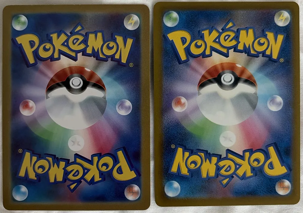
At arm's length they are nearly identical, and that is the point: the design, the gold border and the logo all look right on the fake. What gives it away is the surface. The genuine back is a darker blue with a visible grain; the fake is lighter and smoother, with soft airbrushed gradients. Zoom into a plain blue area of the same photo and the difference stops being subtle:
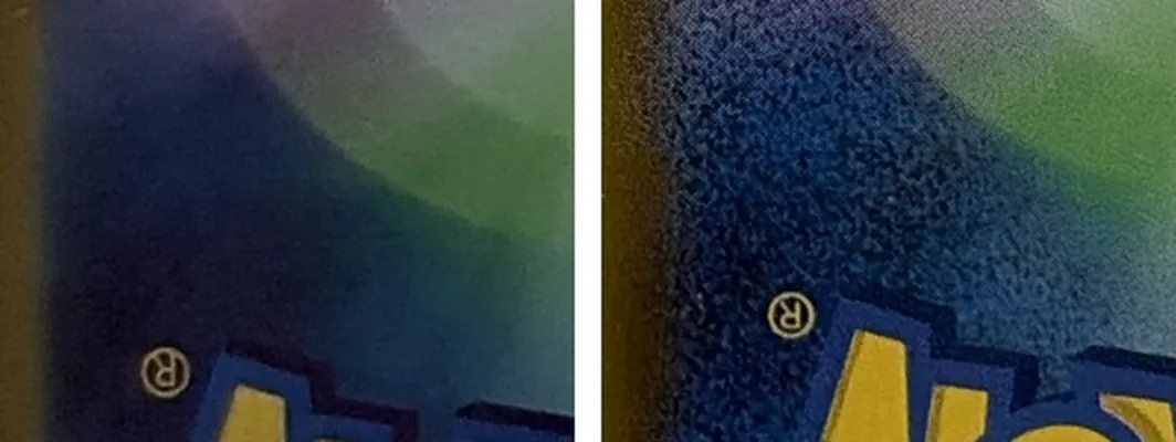
That speckle on the right is the canvas texture this whole guide is about, and it shows up in a normal phone photo once you zoom in. The fake has none of it.
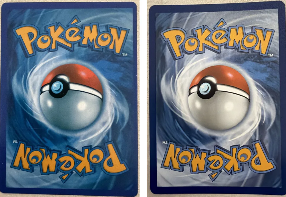
The Western pair shows the color tell from mistake 3: the counterfeit is a darker, more saturated blue, and the white swirl around the Poké Ball is dimmer. Notice what does not differ: the logo looks the same warm orange-yellow on both. Photos shift that color on real cards too, which is why a single color on its own proves nothing. These two were photographed separately, so treat the blues as supporting evidence and look for the texture.
How to photograph a card back to judge it
Most “is this back real?” photos are unjudgeable — direct flash kills the texture. Whether you're posting to a forum or running the card through a scanner, the same technique applies:
- Soft, angled light. Daylight from a window, or a lamp off to one side. Light raking across the surface makes the texture visible; light head-on flattens it.
- No direct flash. Flash bounces straight back and turns any card — real or fake — into a glare blob.
- Fill the frame and focus. The card should occupy most of the photo, sharp enough that you could read fine print at that distance. Blurry texture is invisible texture.
- Add one macro if you can. A close-up of a plain blue area (not the Poké Ball) shows the dot pattern best.
These are, not coincidentally, the same rules that get you a useful result from an automated check — the back photo is mandatory in TCG Verdict precisely because of everything in this article.
What the back does NOT tell you
A high-end counterfeit can get the back nearly right. Passing the back check narrows the odds; it doesn't close the case. The checks that catch better fakes are on the front: typography (font and kerning on the name, HP and attack text), the copyright line (era-specific font, wording and position that counterfeiters consistently botch), and the holo pattern for the card's era. The back is check one of several — I walk through all eight, ranked by reliability, in the full guide to spotting fake Pokémon cards.
FAQ
Why do fake card backs look glossy?
Counterfeiters usually print on cheaper coated stock and often add a varnish layer to make colors pop. Real backs have a matte, subtly textured finish — the glossiness is a byproduct of cutting corners, and it's one of the fastest tells.
My card's back is darker than my other cards — is it fake?
Not necessarily. Blue tone varies between eras and print runs, and even lighting changes how it photographs. Compare against a known-real card from the same era before worrying, and weigh the texture more heavily than the exact shade.
Can a fake have a perfect back?
High-end counterfeits can get close, which is why no single check is a verdict. If the back passes, move on to typography, the copyright line and the holo pattern — good fakes rarely get everything right at once.
Keep reading
- How to Tell if a Pokémon Card Is Fake: The 8 Checks That Actually WorkBack texture, typography, holo pattern, copyright line and more — every check collectors use, ranked by reliability.
- The Pokémon Card Light Test: How It Works, and When It Lies to YouThe most famous DIY check, done properly — plus the failure cases nobody tells you about.
- I Thought My Pokémon Packs Were Fake: What I Checked (A True Story)Two kiosk packs, pulls that were too good, and a night of spiraling — everything I checked, including the wrapper tells almost nobody covers.
- Is Grading Worth It? PSA/CGC vs a Quick Authenticity CheckGrading costs $15–50 a card and takes months; a quick check takes 30 seconds. When each is the right call, and the order to use them in.
- How to Spot Fake Pokémon Cards on eBay (Before You Buy)You can't hold the card, so you read the listing instead — price, photos, wording, seller — and check the seller's own photos before you bid.
- Japanese Pokémon Cards: Real or Fake? Why Yours Looks Different (and Probably Isn't Fake)Most "is my Japanese card fake?" scares are just a different print market. What is normal on a Japanese card, and the few things that still point to a fake.
- Fake PSA Slabs Exist: How to Verify a Graded Pokémon Card in One MinuteThe card inside a real slab is already authenticated, so scammers fake the slab. The free one-minute cert check, and what to do when it fails.
- How to Read a Pokémon Card's Copyright Line, Set Symbol and NumberThe footer of the card is a fingerprint: copyright line, set symbol, card number, rarity, regulation mark. What each one means and where fakes slip up.
- Fake or Resealed? How to Check a Pokémon Booster Box or Pack Before You Open ItCounterfeit packs fail on print, resealed ones on seams. The shrink wrap, crimp and price checks for sealed product, before and after you open it.
- Misprint or Fake? How to Tell a Real Pokémon Error CardJudge everything the error didn't touch: a real misprint has a perfect back, fonts and footer. The factory error patterns, and the fakes sold as rare errors.
TCG Verdict provides an advisory opinion based on photos, with an explicit confidence level. It does not replace a physical inspection or professional grading (PSA/CGC). Pokémon is a trademark of its respective owners; TCG Verdict is not affiliated with, or sponsored by, Nintendo or The Pokémon Company.